
 |
| The Lady - 11.7" x 16.5" marker on heavyweight paper |
I created this piece a couple of weeks ago while sitting on the couch. I woke up that morning and remember feeling anxious about the day though it was my day off. My mind was going over at the chores I needed to do and errands to run - shop for some groceries, mail out a few letters, tidy up storage, etc. And there was suddenly another voice that insisted I stop. I grabbed for paper and my markers, selected the colours I was drawn to and away I went. I felt this compulsion to put colour on the page...lots of bright pinks, with pops of green, grey blues, hints of turquoise and purple. There's a sense of containment about the piece but also a desire to move beyond the borders of the paper. I don't know if it's my need for control that ends up mastering most of my art work or my understanding of composition and balance. I want to produce a piece that is pleasing to the eye but also speaks to my inner world. As we all know, the past year has been a difficult one, and I forget where I heard this but it truly describes what the world has been going through, "We are in the same storm but not in the same boat." Well, this piece is a small reflection of my storm. I want so much for these colours to permeate my life, to see through this prism and like it's been said, to live in colour! The blue greys show some sadness and depth of feeling. The pinks and reds show a will to be and thrive, to grow beyond this time and experience. And that's when she appeared. I had no intention of putting her there. It was strictly going to be an abstract piece. But, I'm glad she's there. Who is she? I don't know but since I have long, dark hair, I'll assume it's me. She's strong and resilient, larger than life...and she's on the right side of the page, which can be symbolic of the future. So maybe this says I can look within for strength, that I can experience the world the way I want, that it's okay to acknowledge hurt and pain, that's it's okay to be with it for a while, to explore its existence as a way of moving forward. Green is a colour of freshness and inspiration and of nature. I want more of that. I noticed I didn't give her any hands and I wasn't even sure if those were arms which is just as well, I suppose, because she seems otherworldly. The look on her face suggests she's been around for a long time. She's tough, wise, and can see right through you. There's also compassion there. She reminds me not to lose sight of the need for compassion with others and ourselves.
 |
| Simplicity - 11.7" x 16.5" marker on heavyweight paper |
 |
| Swirls - 10" x 7.6" marker on mix media paper |
For these two, I created some lines in a circular motion making sure not to draw too many straight lines. I wanted the lines to flow and move freely. I coloured in the shapes I saw in either red, pink purple or green. Compositionally, I feel the images are complete. It's interesting...when it comes to creating, I always know when the drawing is 'complete'. There are times I may return to a piece to determine whether I should keep going but I never do. Once it's done, it's done...the moment I put the markers away. Maybe it's my Tarot skills coming into play. I wouldn't dare pull another card because I'm not satisfied with the message of the original card. I treat Art this way, too. I was feeling a bit more at ease within myself here. I like the orange that surrounds the first drawing and the black that envelops the second. Orange is my colour for creativity and expansion. Black is bold and direct. Again, there's containment even in fluidity, unlike water that moves and gets into anything along its path and also like water that saturates matter and is therefore, contained through that absorption. I also note empty spaces. Sometimes, there's a need to fill everything in, and a thought that somehow too many empty spaces produces an unfinished piece of work. I guess that goes back to the idea of completion in a way. But there is something to be said about 'space'. A certain feeling is produced when that space is framed by specific lines and shapes. The proximity of these lines and shapes to each other both envelops and is surrounded by space. I took some risks here...the kind I'd like to take in my life...without worrying what another person might think or say. I felt free and shameless. No judgment here. Sometimes, we find simplicity by working through chaos and complication.
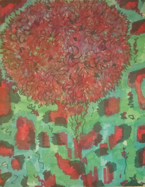 |
| The Rising Flower - 11" x 14" marker on bristol vellum surface |
My intention was to draw a tree but it turned out
to be a huge flower. It's bathed in blue greens with soft splashes of reds,
pinks and dark greens. I feel so at peace when I look at this particular
drawing. As I was placing the colours on the page, I recalled how it felt to
paint. Using marker is different though. Here, you can see the horizonal and
vertical lines. They don't blend as easily. But, my desire wasn't to blend. I
like the effect of producing a third colour by going over the original lines. I
also notice some squiggly lines. They help to bring the drawing together and
support the lightness and airiness of the rising flower, which is moving up
towards the heavens...like a balloon. Yes, I also long to rise and move without
restriction towards that special place within my heart. It's a supportive and
forgiving place, so loving and filled with gratitude. The green here feels
healing and warm. This flower fills most of the upper portion of the page.
Perhaps, at the time, it represented my 'present', my state of being or again,
a longing to return to a place I call 'home'.
 |
| Houses - 11" x 14" marker on bristol vellum surface |
Normally, I would deal with the
background first but here, I started with splashes of colour and placed them
all over the page by starting with one colour, then applying the second, third,
fourth, etc. so that each 'house' looked similar. I then filled in the space
and background with a bright green. I was so drawn to this colour and against
the pinks and mauve, the entire piece just popped with happiness. That's the best
way I can describe it. I didn't see 'houses'. It was my husband that pointed
out that they looked like the tops of houses in a community. I see them, too,
and the green lawns, indicative of spring and newness. I added some dark navy
blue lines and also dark green rectangles. What a melody of colour...Each
'home' is an integral part of the whole. It sings and dances and contributes in
its own way to the overall function of this system.


No comments:
Post a Comment